01
The problem I saw
The first choice comes before the match: which rival should I pick? A name and portrait can attract attention, but do not show how each fighter plays.
02
What I built
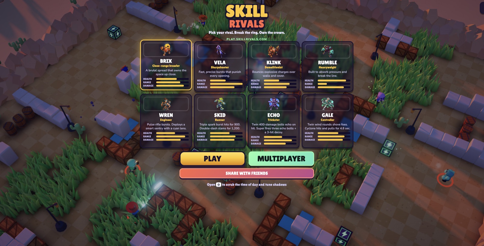
The title screen presents eight selectable rivals: Brix, Vela, Klink, Rumble, Wren, Skid, Echo, and Gale. Each card pairs a role and combat summary with Health, Range, and Damage bars. Play, Multiplayer, and Share with friends appear as separate entry points.
03
What I learned
Shared stats make the roster easier to scan. Only a real match can show whether these rivals feel different to play.
PAIN POINTS
What the product addresses
- Choosing a fighter without seeing its trade-offs
- Character flavor that does not explain how rivals differ
DECISIONS
Decisions that shaped it
- Keep the arena visible behind character selection.
- Give every rival the same three stats so players can compare them quickly.
- Show each role and attack summary before a player enters a match.
LEFT OUT
What I deliberately did not build
- Treating a Multiplayer button as proof that online sessions work reliably.
MEASURES
What I would measure
- Which rivals players choose most often.
- How often players switch characters between matches.
- Whether multiplayer matches start and reconnect reliably.
EVIDENCE AND BOUNDARIES
What this note is based on
- Visible on play.skillrivals.com on 25 September 2026: the title screen shows eight rival cards, role labels, combat summaries, three stat bars, and Play, Multiplayer, and Share with friends controls.
- This note records the public title screen only. I did not verify multiplayer sessions, server-side match resolution, balance, retention, production readiness, revenue, or player analytics.
RELATED WORK